Overview
Understand and grasp the idea and vision for the fourth-year grad showcase. Assist them by organizing and designing important aspects of the showcase to allow it to move smoothly in a visually appealing way. Research other showcases as well as professional typefaces and illustration factors.


Objective
Create a Logo with variations, a graphic toolbox, a motion graphic, web banner, a welcome poster, a promotional poster, and lanyards/name badges. Look at all of the names of the showcase performers to ensure each name will fit on each tent and ID card. Incorporate colour and excitement in the design while keeping it creative and professional. Focus on a long and in-depth process to ensure each aspect of the design is thought through and effective.

Audience
- Conestoga College Graphic Designers
- 20s - 30s Interested in Graphic Design of All Genders
- Conestoga College BDES Applicants
- Conestoga College Alumni & Professors
- Marketers
Personal Objectives
- Successfully Portray the Vision of the Grad Students
- Create a Brand Inspired By the Ideation Process
- Include Multiple Colours to Create Portfolio Diversity & Excitement in the Untitled Brand
- Create a Youthful, Playful, yet Professional Feeling


Tools & Softwares
- Adobe Illustrator
- Adobe Indesign
- Adobe After Effects
- Adobe Photoshop
- Adobe Media Encoder
Deliverables
- Logo & Variations
- Web Banner
- Graphic Toolbox
- Motion Graphic
- Welcome Poster (20x30)
- Promotional Poster (20x30)
- Lanyards
- 5 Instagram Posts
Research
Aspects to Include in Welcome Poster
- Name of Event
- Date and Time
- Location
- Ticketing or Contact Info - Web Address
- Date and Time
- Location
- Ticketing or Contact Info - Web Address
- Special Features
- Graphics
- Focus on a Target Market
- Include Logo
- Include Description of Event - Consistent type and feeling
- Create Harmonic Balance
- Graphics
- Focus on a Target Market
- Include Logo
- Include Description of Event - Consistent type and feeling
- Create Harmonic Balance
Do Not Include
Additional Details that can be spoken at the event (Do not overcrowd poster) Any Long Lists are too large of body text
Additional Details that can be spoken at the event (Do not overcrowd poster) Any Long Lists are too large of body text
Things to include in Event Advertising
Have either an interesting logo that pulls in consumer's attention through questions, or one that strictly represents your brand to have a niche target market
All crucial information such as date and location, time, graphics, contact information
All crucial information such as date and location, time, graphics, contact information
When creating a logo it is important to have a consistent harmonic balance. If using sharp and geometric shapes, keep that consistent throughout the brand. If the logo is soft and round, have that feeling kept consistent within the brand. Keep the colour schemes consistent and have multiple coloured logos for different coloured backgrounds. Ensure the logo is eye-catching and intriguing and focuses on attracting your target market.
Process


Rationale
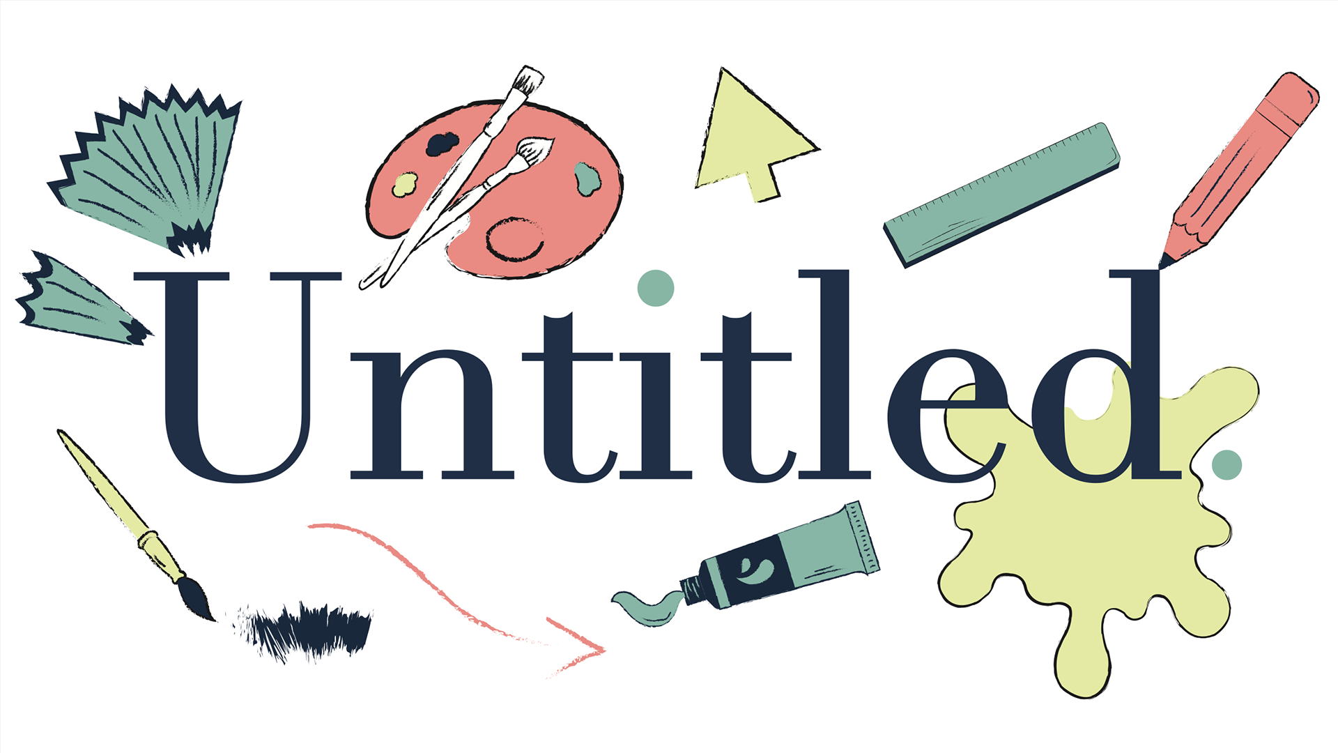
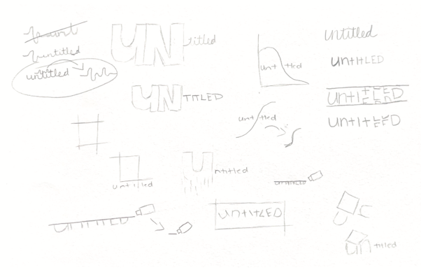
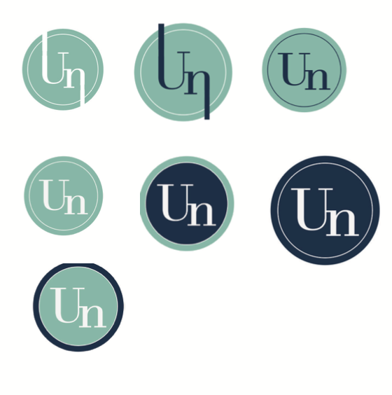
Untitled became a brand based on the ideation process and the chaotic mess behind it. The brand identity follows the beauty of creation and understanding how messy the ideation process can be, and how much it impacts the final result of a piece of art. Incorporating sketchy lines, layering, textures, and different small graphic illustrations it began to look like a brainstorming page. These aspects help portray the beauty of creation.
The colour scheme for untitled came from the representation behind each color. Not only are they fun colours that bring bright and exciting feelings to a viewer, but they have meaning that represents creation. Green represents growth, which reflects the difference from the beginning of the process to the end. Blue represents creativity and flow allowing thoughts and ideas to come from within and grow into a piece of art at a larger scale. Pink incorporated the representation of love and compassion. This was taken as love and compassion towards art and creation, instead of the feeling itself. And lastly, the white was used to represent a blank canvas and the start of something new.
The target audience for this brand would be upcoming designers of all genders. It helps teach them that the creation of art is messy in the beginning and it’s not something to worry about. This was an important idea when creating Untitled as it puts meaning behind the brand and helps new artists as well.
The typography chosen for this brand was used in a way to ensure the chaotic brainstorming still reflected a professional appearance. Using Didot for headers to allow clear and legible type, and using Gatu to match the same curves of Didot, however, this typeface has less dramatic characteristics which allow the body text to be more readable.