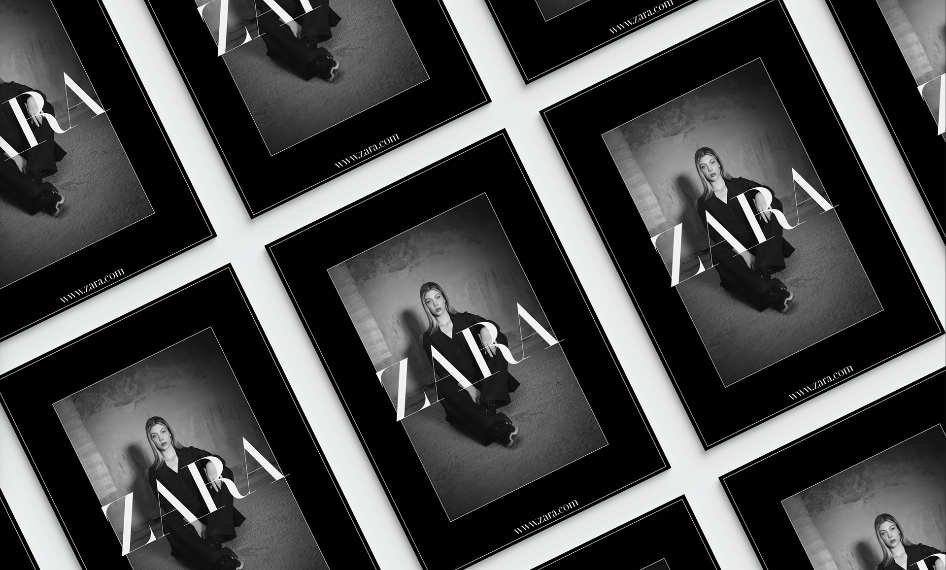
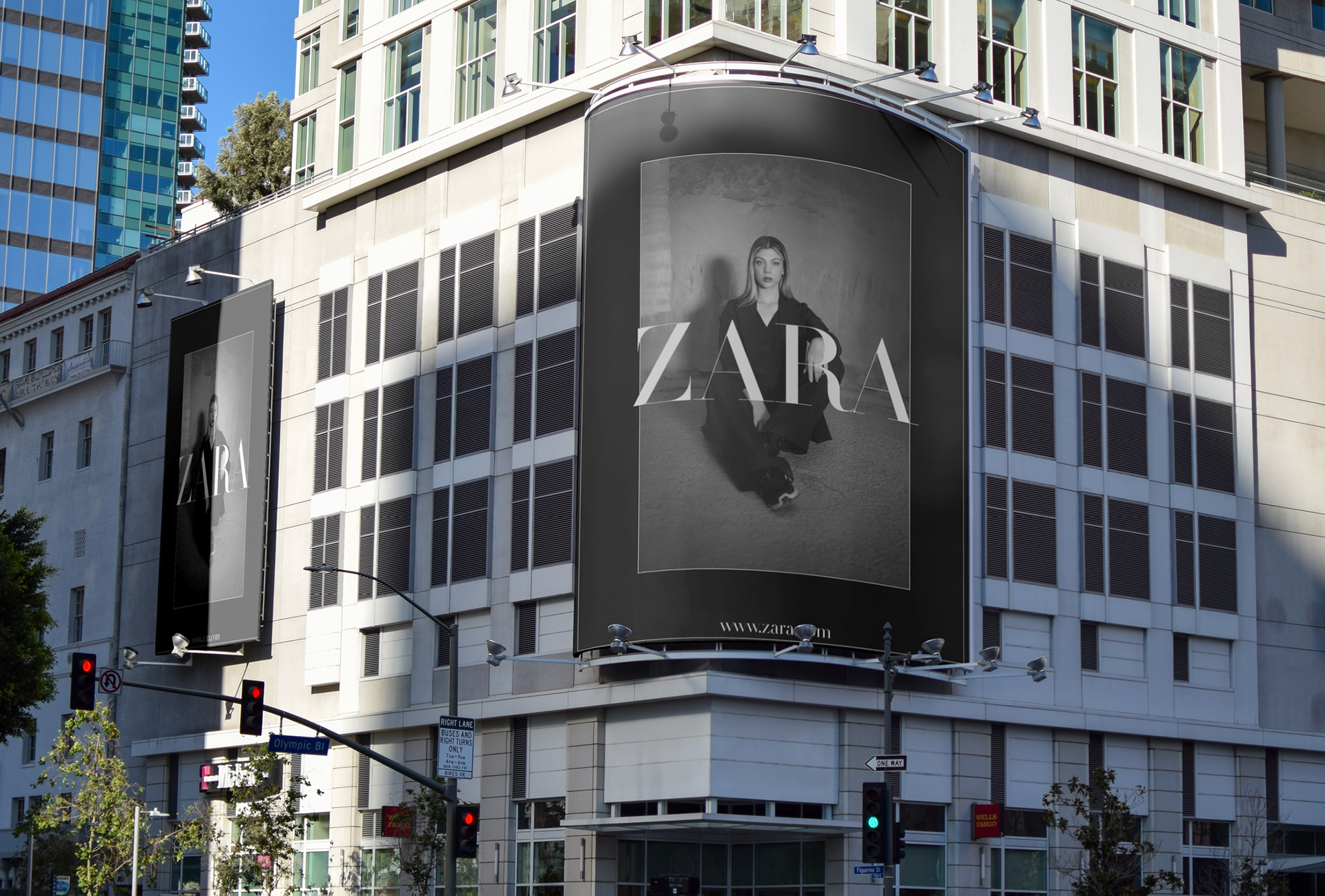
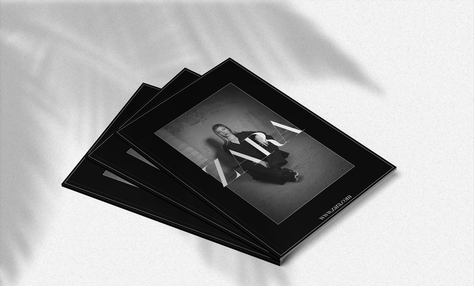
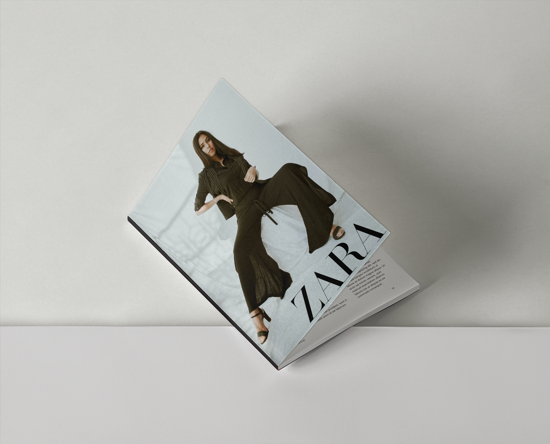
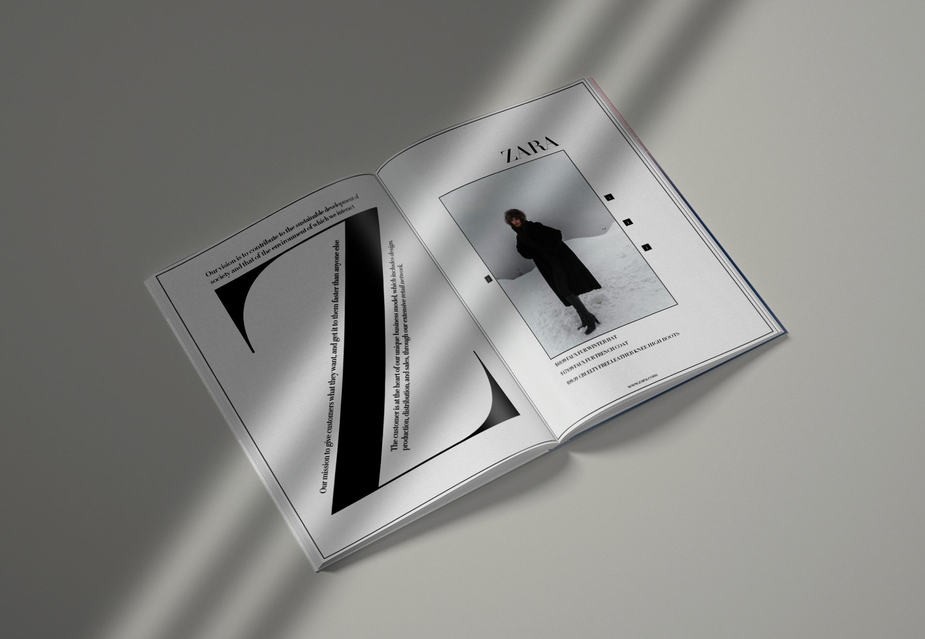
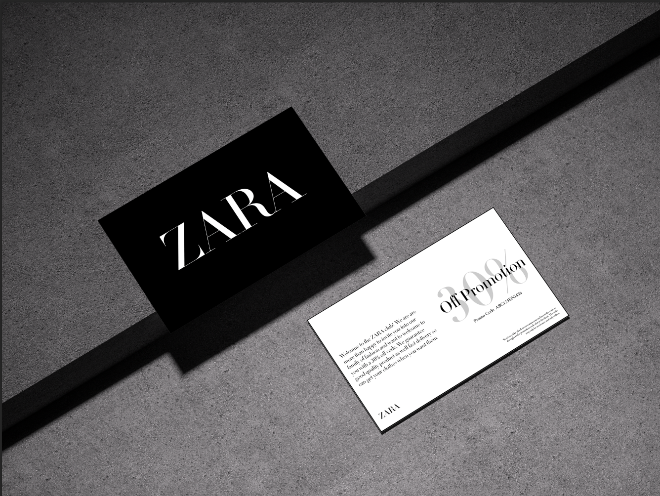

This piece was designed around the brand Zara and their identity. Using previous work they have created for advertising, I used design aspects they tend to incorporate to make a mock magazine cover, Promotion Card, and Campaign Editorial. Using Didot Title as the typeface to match their logo typography. The black and white colour palette creates high contrast creating cohesive pieces that create unity with the current Zara marketing.